In today’s hyper-competitive digital marketplace, businesses face an increasingly complex challenge: capturing customer attention whilst simultaneously reducing cognitive friction in the decision-making process. The phenomenon of offer clarity directly impacts conversion rates across all industries, with research consistently demonstrating that simplified value propositions outperform their complex counterparts by significant margins. This psychological principle stems from fundamental limitations in human information processing capabilities, where excessive choice and unclear messaging create barriers that prevent potential customers from taking decisive action.
Modern consumers are bombarded with thousands of marketing messages daily, creating an environment where decision fatigue has become a critical factor in purchase behaviour. When faced with overly complex offers containing multiple variables, pricing tiers, or unclear benefit statements, the human brain naturally defaults to avoidance rather than engagement. This cognitive response represents a profound shift in how businesses must approach offer design and presentation in the digital age.
Cognitive load theory and offer comprehension in digital marketing
Cognitive Load Theory provides the foundational framework for understanding why simplified offers consistently outperform complex alternatives in digital marketing environments. Developed by educational psychologist John Sweller, this theory explains how the human brain processes information through three distinct types of cognitive load: intrinsic, extraneous, and germane. When applied to marketing contexts, intrinsic load represents the essential mental effort required to understand the core value proposition, whilst extraneous load encompasses all the unnecessary complexity that distracts from decision-making.
Research conducted by leading conversion optimisation experts reveals that high-performing landing pages typically reduce extraneous cognitive load by eliminating superfluous elements that don’t directly contribute to the primary conversion goal. This principle extends beyond visual design to encompass offer structure, pricing presentation, and benefit articulation. When customers encounter offers that exceed their cognitive processing capacity, they experience what researchers term « analysis paralysis » – a state where decision-making becomes increasingly difficult as options multiply.
Miller’s rule of seven and information processing limitations
George Miller’s groundbreaking 1956 research established that the average human can hold approximately seven pieces of information in working memory simultaneously, with some studies suggesting the actual number may be closer to four. This limitation has profound implications for offer design, particularly in digital environments where attention spans are measured in seconds rather than minutes. Successful offers typically present no more than three to five key benefits, allowing prospects to process information without overwhelming their cognitive resources.
Contemporary neuroscience research using functional magnetic resonance imaging (fMRI) has validated Miller’s original findings whilst providing deeper insights into the neural mechanisms underlying information processing limitations. When presented with offers containing more than seven distinct elements, brain activity in the prefrontal cortex – the region responsible for executive decision-making – shows increased stress responses and decreased efficiency in neural pathway activation.
Choice overload paradox in e-commerce conversion funnels
The choice overload paradox, first documented in Sheena Iyengar’s famous jam study, demonstrates that whilst consumers initially express preference for greater variety, they are significantly more likely to make purchases when presented with fewer options. This research has been replicated across numerous e-commerce contexts, consistently showing that reducing choice complexity can increase conversion rates by 15-30%. The phenomenon occurs because excessive choice triggers what psychologists term « maximiser behaviour, » where individuals attempt to evaluate every possible option before making a decision.
Modern A/B testing platforms have validated these findings across millions of user interactions, with companies like Unbounce and Optimizely reporting that their highest-converting clients typically offer three or fewer primary options on key landing pages. This approach reduces the cognitive burden on potential customers whilst simultaneously increasing the perceived value of each available option through what economists call the « scarcity principle. »
Dual-process theory applications in purchase decision making
Dual-Process Theory, developed by Daniel Kahneman and others, explains how human decision-making operates through two distinct systems: System 1 (fast, intuitive, automatic) and System 2 (slow, deliberative, analytical). Clear offers leverage System 1 processing by presenting information in formats that allow for rapid, intuitive comprehension. Complex offers, conversely, force prospects into System 2 processing, which requires significantly more mental energy and time investment.
Successful digital marketers understand that most purchase decisions begin with System 1
and are later justified or refined by System 2 analysis. In practice, this means that if your offer is not immediately understandable at a glance, you are forcing visitors into a high-friction decision mode where abandonment is the most energy-efficient option. Clear, simple value propositions act like well-lit signposts on a dark road: they allow System 1 to recognise relevance, safety, and direction without overthinking. Once that intuitive « this makes sense for me » reaction is triggered, prospects are far more willing to invest System 2 effort in comparing plans, reading details, or completing a form. Complex offers reverse this sequence, demanding effort before trust, and thereby losing a large share of potential buyers before the real evaluation even begins.
From a digital marketing standpoint, this is why concise headlines, scannable benefit bullets, and straightforward pricing tables consistently outperform jargon-heavy, feature-dense presentations. We are not just optimising for clicks; we are optimising for the way the human brain naturally prefers to make purchase decisions. When you design for System 1 first and System 2 second, you transform your offer from a cognitive puzzle into an obvious next step. The result is higher conversion rates, shorter sales cycles, and a user experience that feels intuitive rather than exhausting.
Visual hierarchy impact on offer clarity and user engagement
Visual hierarchy is the structural backbone that determines how users scan and interpret your offer on a page. Eye‑tracking research consistently shows that digital users follow predictable scanning patterns (such as the F‑pattern and Z‑pattern), giving primacy to elements like headlines, primary images, and call‑to‑action buttons. When these elements are aligned around a single, clear offer, comprehension time drops, and engagement metrics such as scroll depth, click‑through rate, and time on page improve. Conversely, cluttered layouts with competing focal points force users to waste cognitive resources on figuring out where to look before they can even decide what to do.
Clear visual hierarchy in offer design is not just about aesthetics; it is a conversion lever. By giving the primary value proposition the largest typographic weight, positioning pricing and key benefits near the fold, and visually de‑emphasising secondary links, you guide the user through a streamlined decision path. Think of it as arranging items on a desk: if the contract, pen, and signature line are neatly presented in front of someone, they are far more likely to sign than if they must dig through piles of unrelated documents. In digital marketing terms, strong hierarchy reduces cognitive load, increases offer clarity, and nudges users towards the intended action with minimal resistance.
Conversion rate optimisation case studies: simple vs complex value propositions
While cognitive psychology provides the theoretical foundation for why clear offers convert better, real‑world case studies demonstrate the tangible revenue impact of simplified value propositions. Across industries, from e‑commerce to SaaS, brands that reduce complexity in their offers consistently report improvements in conversion rate, average order value, and customer satisfaction. These gains often occur without any increase in traffic or ad spend, underscoring that the clarity of your offer can be a more powerful growth driver than additional marketing channels.
To illustrate this, we can examine several well‑known digital products that deliberately chose simplicity over feature bloat in their early positioning. In each case, the winning approach was not necessarily the most powerful product, but the one that customers could understand and act on fastest. By studying how companies like Amazon, Basecamp, Dropbox, and Slack structured their offers, we can extract practical principles you can apply to your own conversion funnels.
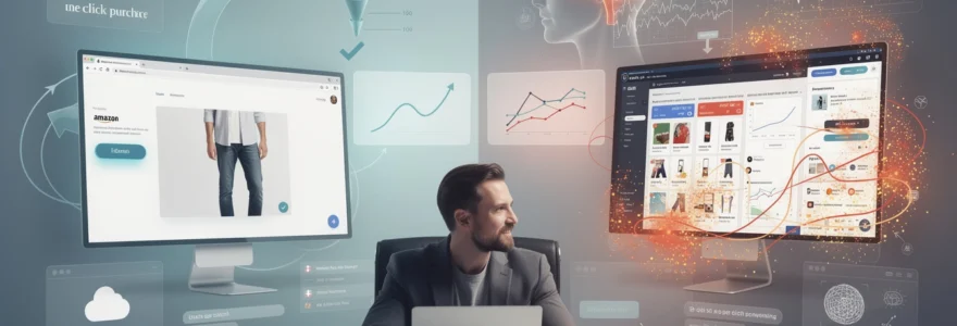
Amazon’s one-click purchase vs traditional multi-step checkout processes
Amazon’s introduction of the One‑Click Purchase mechanism is one of the most cited examples of how removing friction from an offer path can dramatically increase conversions. Traditional e‑commerce checkouts often required users to navigate multiple pages: cart review, account creation, shipping details, billing details, and final confirmation. Each extra step added both cognitive and procedural load, giving users numerous opportunities to second‑guess their decision or abandon the process altogether. Cart abandonment rates in such flows have historically hovered around 60‑80%, according to multiple industry benchmarks.
By contrast, Amazon’s One‑Click offer reframed the purchase journey as a single, reversible decision. Once users had stored their details, the call‑to‑action essentially communicated, « Press this once to get the item delivered to you, » compressing the mental workload into a yes/no choice. Studies and internal reports have suggested that this simplification not only boosted conversion rates but also increased impulse purchases, because the perceived effort of buying dropped close to zero. For digital marketers, the lesson is clear: a streamlined offer path – fewer fields, fewer steps, less redundancy – often converts better than a feature‑rich but cumbersome checkout process.
Basecamp’s feature-light positioning against comprehensive project management suites
In the crowded project management market, Basecamp carved out a distinct position not by claiming the most features, but by promoting itself as the antidote to complexity. While enterprise suites emphasised extensive functionality, customisation, and integrations, Basecamp led with a clear, simple promise: help teams stay organised and communicate in one place. Its marketing repeatedly stressed what it does not do, deliberately excluding advanced features that would confuse small teams or lengthen the onboarding process.
This « feature‑light » positioning allowed Basecamp to communicate a clear offer to a specific audience: small businesses and teams who were overwhelmed by heavy enterprise tools. Their pricing reflected this simplicity – a straightforward, flat fee model instead of convoluted per‑user or tiered licensing. The result was an offer that prospects could understand in seconds and adopt without lengthy evaluation cycles. For your own value proposition, the Basecamp example shows that narrowing your scope and saying « no » to certain features or segments can make your core offer far more compelling to the right customers.
Dropbox early adoption strategy through simplified cloud storage messaging
When Dropbox entered the market, cloud storage was still a relatively abstract concept for many users. Competing services often described themselves with technical language about servers, sync protocols, and bandwidth. Dropbox chose a radically simpler approach with its early landing pages and now‑famous explainer video: « Your stuff, anywhere. Save your files here and access them from any device. » This single, clear benefit replaced abstract infrastructure talk with a tangible outcome users could visualise.
The impact of this simplified offer was dramatic. Dropbox’s referral program, anchored to this clear value proposition, helped drive exponential growth, with user numbers reportedly increasing from 100,000 to 4 million in just 15 months. The product itself was technically sophisticated, but the customer‑facing promise was stripped down to one core transformation: no more emailing files to yourself or carrying USB drives. This case highlights how a clear offer in digital marketing often means translating complex technology into everyday language that maps directly to the user’s lived frustrations.
Slack’s communication platform launch vs enterprise software complexity
Slack entered a space dominated by entrenched, feature‑heavy enterprise communication tools that required long implementation cycles and formal IT buy‑in. Instead of positioning itself as yet another « unified communications platform, » Slack articulated a simple, human‑centred offer: « Be less busy » and « Where work happens. » Its messaging focused on reducing email clutter and making team communication feel more like a natural conversation than a formal ticketing system. This clarity around the problem and outcome helped Slack spread organically inside teams before moving upmarket.
Unlike traditional enterprise rollouts, Slack’s offer allowed individual departments or even small groups within a company to adopt the tool without complex set‑up or executive approval. The free tier, straightforward onboarding, and playful interface all reinforced the impression of simplicity. Once teams experienced the reduction in communication friction, expansion and paid upgrades followed. Slack’s growth underscores a key principle for offer design: when you launch software in a complex category, a clear narrative about one painful problem and one obvious improvement will often outperform a comprehensive but opaque feature checklist.
Neuromarketing research on decision fatigue and purchase intent
Beyond behavioural data, neuromarketing research provides direct insight into what happens in the brain when users evaluate clear versus complex offers. Decision fatigue – the gradual depletion of mental energy from repeated choices – has measurable neural and physiological correlates. As users move through digital journeys filled with pop‑ups, upsells, and dense pricing tables, their capacity to process information and commit to a decision diminishes.
By contrast, streamlined offers that reduce unnecessary decisions and present an obvious next step show different patterns of brain activity and bodily response. These differences are not merely academic; they correlate with higher purchase intent, stronger post‑purchase satisfaction, and a lower likelihood of buyer’s remorse. Understanding these neuromarketing findings allows digital marketers to design offer structures that respect human limitations rather than fight against them.
Fmri studies on prefrontal cortex activity during complex offer evaluation
Functional magnetic resonance imaging (fMRI) studies have repeatedly shown that complex offer evaluation significantly taxes the prefrontal cortex, the brain region responsible for planning, reasoning, and self‑control. When participants in controlled experiments are asked to choose between many similar products with intricate pricing and feature differences, researchers observe increased activation in these regions along with markers associated with stress and conflict. This « neural overload » often correlates with slower response times and higher rates of choice deferral, where participants choose nothing at all.
In contrast, when experimental subjects are presented with streamlined offers that clearly differentiate options and minimise trade‑offs, prefrontal activity tends to be lower and more focused. Decision times shorten, and self‑reported confidence in the choice increases. For marketers, the implication is straightforward: if your offer structure lights up the brain’s conflict and stress centres, you are literally making it harder for people to buy. Designing offers that reduce unnecessary comparisons and sharply frame the best‑fit option aligns your funnel with the brain’s preference for low‑effort decisions.
Eye-tracking heat maps analysis for landing page element prioritisation
Eye‑tracking studies complement brain imaging by revealing how users visually navigate offers in real time. Heat maps of high‑converting landing pages typically show concentrated attention on a small set of elements: the main headline, the hero image, key benefits, and the primary call to action. Clear offers make these elements easy to find and interpret, with consistent messaging between them. Users spend less time hunting for essential information and more time considering the actual commitment.
Conversely, pages promoting complex offers often exhibit scattered gaze patterns, with users bouncing between multiple competing headlines, dense paragraphs, and secondary navigation. This fragmented attention is a reliable predictor of confusion and exit. By studying eye‑tracking data, you can refine your visual hierarchy and messaging to ensure the core of your offer is seen and understood within the first few seconds. Ask yourself: if a heat map of your current page shows users spending more time on sidebars and disclaimers than on your value proposition, how likely are they to convert?
Electroencephalography data on cognitive strain in multi-option scenarios
Electroencephalography (EEG) provides another window into how the brain responds to offer complexity by measuring electrical activity associated with cognitive strain. In experiments where participants choose among multiple similar subscription plans or product bundles, EEG readings often show elevated levels of beta waves, which are associated with active thinking and sometimes anxiety. The more options and variables participants must juggle – such as different term lengths, add‑ons, and discounts – the higher the measured cognitive load.
When the same participants are later presented with a simplified set of choices – for example, a single recommended plan plus one alternative – EEG data typically reflects reduced strain and smoother decision processing. These findings reinforce the practical guidance for offer design: reducing the number of simultaneous options, clarifying differences between them, and explicitly recommending a best choice can measurably lower cognitive stress. In turn, this lower stress state makes it easier for customers to commit, especially in subscription or high‑ticket contexts where hesitation can quickly turn into abandonment.
Galvanic skin response measurements during simplified purchase journeys
Galvanic skin response (GSR), which tracks changes in skin conductance related to emotional arousal, offers yet another lens on how users experience different purchase journeys. In neuromarketing studies, participants navigating complex checkout flows with multiple upsells, mandatory account creation, and opaque fees often show spikes in GSR, indicating elevated stress and frustration. These physiological reactions frequently coincide with moments where users encounter unexpected information or must make yet another choice.
By contrast, simplified purchase journeys – with transparent pricing, optional extras, and clear progress indicators – tend to produce more moderate, steady GSR patterns. Users still experience arousal, but it is more aligned with positive anticipation than with anxiety or irritation. For digital marketers, this suggests that designing calm, predictable flows around your offers is not just a UX best practice; it directly influences the emotional state in which customers say yes or no. When your funnel feels like a clear path instead of an obstacle course, you are far more likely to see that path end in a successful conversion.
A/B testing methodologies for offer simplification strategies
Translating these psychological and neuromarketing insights into measurable performance gains requires disciplined experimentation. A/B testing remains the most practical tool for validating whether a clearer offer truly converts better for your audience. Instead of relying on opinion or copying competitors, you can incrementally test hypotheses about messaging, pricing display, option count, and layout to see which versions reduce friction and increase conversions.
Effective A/B testing of offer simplification starts with isolating specific variables. For example, you might compare a page with three pricing tiers against one with a single recommended plan and a secondary option, or test a concise headline (« Get your website live in 7 days ») against a more generic promise (« Professional web design services for businesses of all sizes »). To ensure statistical validity, you need adequate traffic, clear primary metrics (such as completed purchases or qualified leads), and test durations long enough to account for daily and weekly behaviour patterns. Over time, this data‑driven approach allows you to build a conversion system where every element of your offer is tuned for clarity.
Persuasion architecture framework for streamlined value communication
Persuasion architecture is the strategic discipline of structuring content, design, and interaction paths to guide visitors towards a specific conversion goal. When applied to offer clarity, it means intentionally sequencing information so that each step answers a key question in the prospect’s mind: « Is this for me? », « Can I trust this? », « What exactly do I get? », and « What do I do next? » Clear offers are not just about fewer words or options; they are about presenting the right information at the right moment in the decision journey.
In practice, a streamlined persuasion architecture might start with a bold, problem‑oriented headline that mirrors the visitor’s pain, followed by a short explanation of the outcome you deliver and a visual that reinforces that transformation. Social proof then reassures the visitor that others like them have succeeded with your solution, while a simple pricing section clarifies the commitment. A prominent, unambiguous call‑to‑action button closes the loop. By designing your pages and funnels around this kind of narrative flow, you prevent users from getting lost in details before they understand the big picture. Instead, you lead them through a coherent story where saying « yes » to your offer feels like the natural conclusion.
Industry-specific implementation of clear offer positioning across verticals
Although the psychological principles behind clear offers are universal, their implementation varies across industries. In e‑commerce, clarity often revolves around transparent pricing, shipping, and return policies, as well as concise product benefits. A fashion retailer, for example, can increase conversions by highlighting size guidance, fabric details, and delivery timelines in a clean, scannable format instead of burying them in dense copy. In software‑as‑a‑service, the focus shifts towards clarifying who the product is for, what problem it solves, and how quickly users can expect to see results, often via a simple comparison of core plans and a clear onboarding promise.
Professional services and consulting face a different challenge: offers are often intangible and customised. Here, clarity means defining a specific outcome, timeframe, and engagement structure rather than selling vague « strategic support » or « transformational coaching. » For instance, a marketing consultant might reposition from « full‑service marketing » to « 90‑day funnel optimisation to increase qualified leads by 25%, » with a defined process and fee structure. In B2B enterprise contexts, where buying committees and longer sales cycles are the norm, clear offers take the form of well‑scoped pilot projects, proof‑of‑concept engagements, or modular packages that reduce perceived risk. Across all these verticals, the pattern is the same: when you make it unmistakably obvious what changes for your customer, how, and on what terms, you remove the biggest hidden barrier to conversion – confusion at the decision point.